Colors in home decor: how to use the color wheel and build a palette for your home
By Lucy Home. Published 14/11/2026, updated 14/11/2026.
The color wheel is the map of colors, and in home decor it serves one purpose: to show which colors sit peacefully together and which create contrast. Neighbors on the wheel, the analogous colors, give harmony. Opposites, the complementary colors, give emphasis. I build the palette of a home with a neutral base, one main color and its neighbor or its opposite, always in a small dose. It is simpler than it sounds, and it avoids the mistake of buying a sofa without knowing what it will talk to.
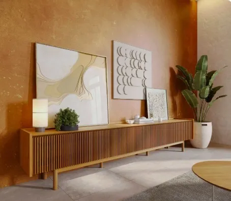
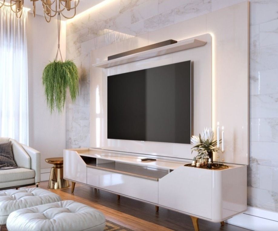
Terracotta wall, wood and sand: three neighbors on the warm side of the wheel, with the green of the plant as a counterpoint. Presentation image of the TV unit, not a showroom photo.
What is the color wheel?
In the definition given by Planner 5D, it is a visual representation of colors arranged to show the relationships between them. There are three groups:
- Primary: red, blue and yellow, which do not come from mixing other colors.
- Secondary: orange, green and purple, each from the mix of two primaries.
- Tertiary: the mix of a primary with the neighboring secondary, such as blue-green.
Which combinations does the wheel teach?
| Combination | How it works | Where I use it |
|---|---|---|
| Monochromatic | Variations in tone of a single color | A whole room in sand, beige and caramel, with texture doing the work |
| Analogous | Neighboring colors on the wheel, with a cohesive, serene feeling | Blue and green in cushions and a painting; terracotta, caramel and wood |
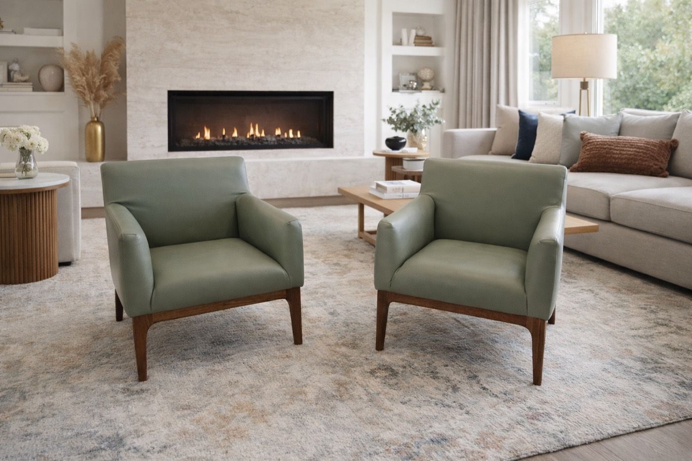
| Complementary | Colors in opposite positions, with strong contrast | A caramel leather sofa with a blue cushion; a green chair near reddish wood |
The complementary scheme asks for care with the dose: one of the two colors leads and the other shows up a little. Half and half, the two fight.
Warm, cool and neutral colors: what does each one do?
Planner 5D associates warm colors, such as red, orange and yellow, with energy, enthusiasm and warmth, and says they stimulate appetite and conversation. Cool colors, such as blue, green and purple, convey calm, serenity and focus. That is why a dining room takes warm tones well and a bedroom asks for cool ones.
Neutrals sit outside the wheel and are the base of almost every living room: white, off-white, sand, beige, gray and the wood tones. Earthy tones, such as terracotta, caramel, ochre and brown, are muted warm colors, which is why they pair so easily with wood and leather.
How do I build the palette of a home in four steps?
- Start with what does not change. The floor, the countertop, a family piece. They are already colors in the palette.
- Choose the neutral base. Wall, sofa and large rug. It is the largest area in the room.
- Choose one color and its companion. The neighbor on the wheel for a calm home, the opposite for a point of emphasis.
- Distribute in doses. The 60-30-10 rule, which I explain in the guide to color combinations in the living room, is the starting point: a lot of base, some secondary, a little accent.
Repeat the accent color in at least two places, such as a cushion and a painting, so it reads as a choice and not an accident.
Which colors go with gray, beige and brown?
These are the three questions I hear most, because they are the most common sofa colors. What I answer in the showroom:
| You already have | Goes with | What I avoid |
|---|---|---|
| Gray sofa | Wood, caramel, beige and terracotta for warmth; mustard or green for life | A cold white wall with everything gray around it |
| Beige or sand sofa | White and off-white for lightness; green, blue and terracotta as accents; medium wood | Everything in the same beige, with no texture or contrast |
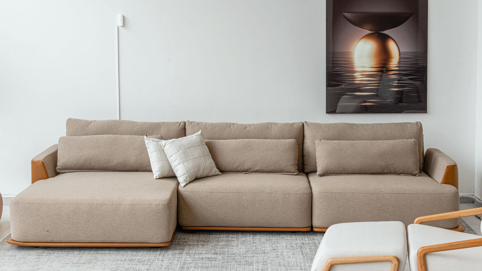
| Brown or caramel leather sofa | Off-white and sand as the base; green for a natural feel; blue for contrast | Dark wood in all the other furniture |
Blue works with brown and caramel because brown is a darkened orange, and blue sits opposite orange on the wheel. It is the complementary scheme at work without anyone noticing.
Where does the furniture come in?
Sofa, table and wood are the largest patches of color in the room, after the wall. That is why I decide the palette before buying, not after:
- Sofa: Lucy Home customizes color and fabric when you order. It pays to arrive with the palette in mind. See our sofas.
- Armchair and chairs: the best place for the accent color, because they take up little space and show a lot. See the armchairs and the chairs.
- Wood: it counts as a warm color. Reddish wood asks for green nearby; light wood accepts almost anything.
- Wall: it enters the calculation too. The guide to wall color for the living room shows what goes with each sofa.
Light changes everything: the same color is one thing in the morning and another at night, under the lamp. In the guide to living room lighting I explain why.
Build the palette with us
At Lucy Home, at Avenida Presidente Kennedy, 3870, Aviação, Praia Grande, the furniture is set up in rooms, and you can see the colors together, with rug, wood and cushion, and not just in a catalog. The team helps you plan the room at no cost: message us on WhatsApp with a photo of your living room and of the pieces that are staying, and we suggest the combination.
Pieces mentioned in this article
- Ask about this model
Leather armchair
Presentation image of the model.
- Ask about this model
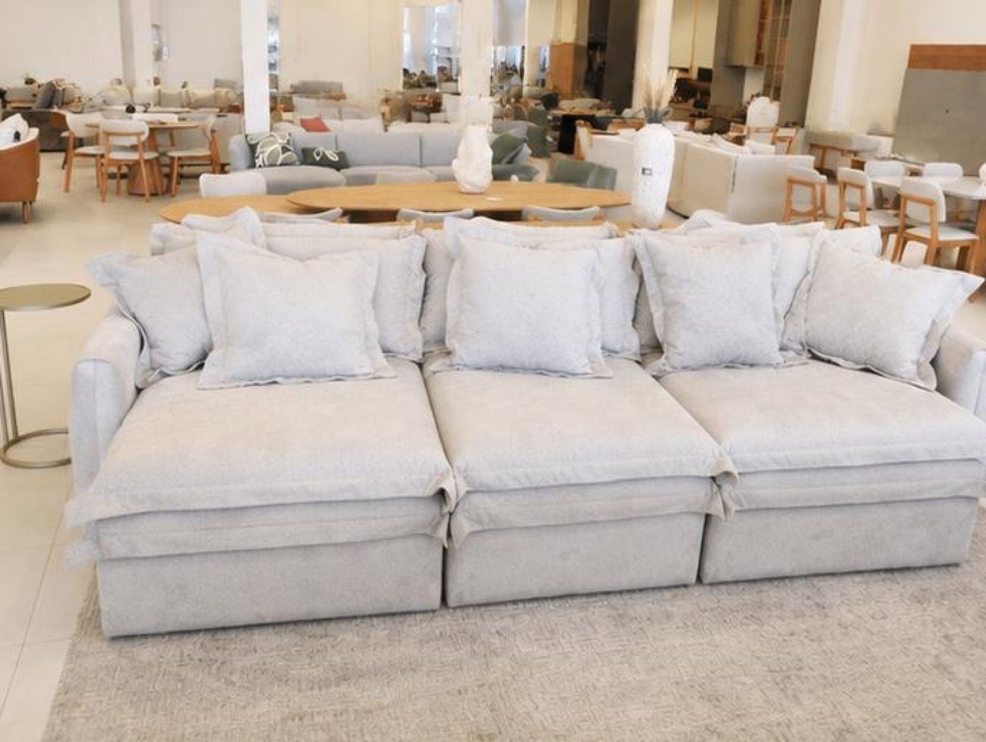
Diamond sofa
- Ask about this model
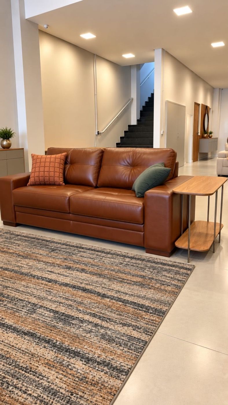
Fixed leather sofa
Presentation image of the model.
- Ask about this model

Org dining table
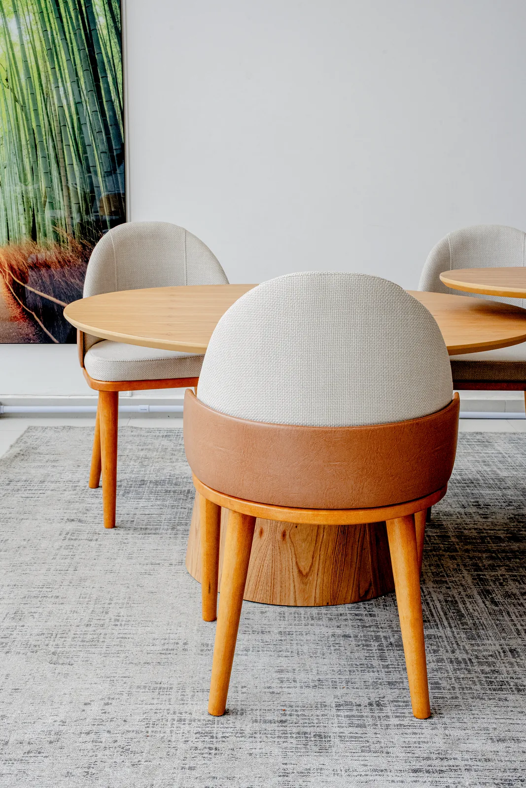
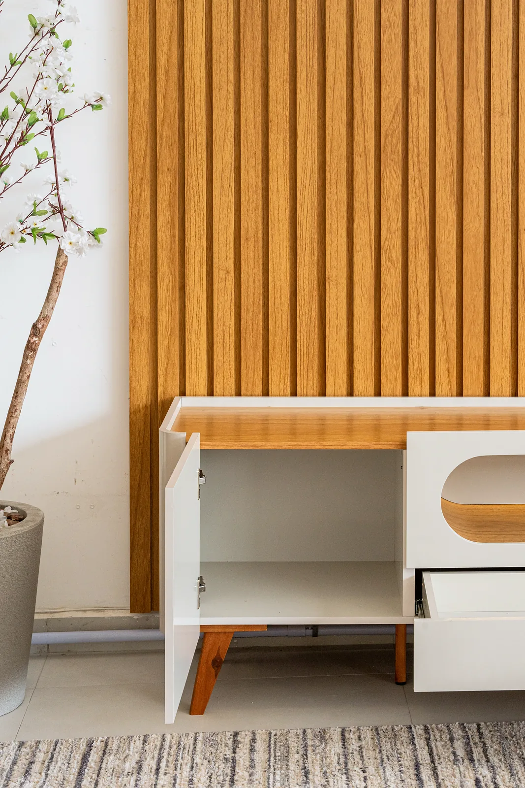
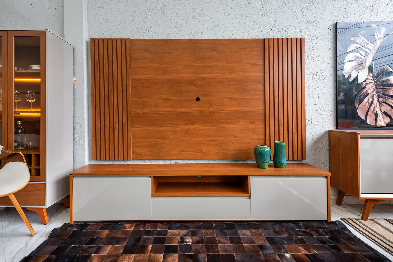
The furniture in this article, in Lucy Home photos
Frequently asked questions
What is the color wheel?
It is a visual representation of colors arranged to show the relationships between them, in the definition given by Planner 5D. It starts from the three primaries, red, blue and yellow, goes through the secondaries, orange, green and purple, and reaches the tertiaries, which mix a primary with the neighboring secondary.
What are analogous and complementary colors?
Analogous colors sit side by side on the color wheel, such as blue and green, and create a cohesive, serene feeling. Complementary colors sit in opposite positions, such as blue and orange, and create strong contrast.
Which colors go with brown?
Brown is a warm neutral. I pair it with off-white, sand and beige to keep it light, with green for a natural feel and with blue when I want contrast, because blue sits opposite orange, which is where brown comes from.
Which colors go with gray?
Gray accepts almost anything, but on its own it cools the room. I warm it with wood, caramel, beige and terracotta, or liven it up with mustard and green. Gray with white and yet another gray is the combination I avoid.
Warm or cool colors in the living room?
It depends on the mood you want. Planner 5D associates warm colors, such as red, orange and yellow, with energy and conversation, and cool ones, such as blue and green, with calm. In a beach living room I use a neutral base, wood for warmth and one cool color in the details.